As Urdu is official language in my part of the world and Arabic is our religious language, the calligraphy has always been a big part of my life. In fact, it’s something my mother taught me even before the school. She introduced me to this art form providing me with wooden boards and pens and teaching me the alphabet.
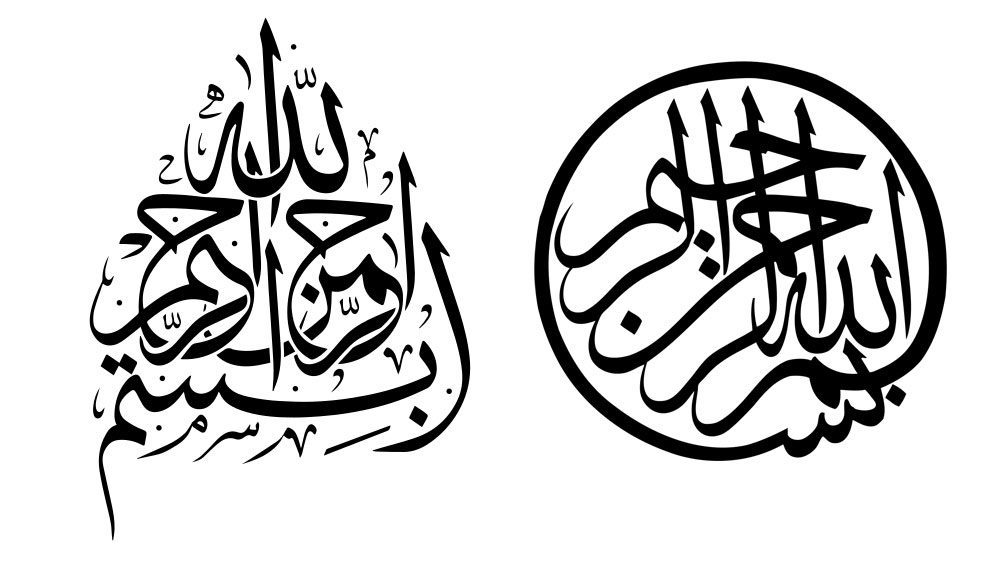
During my school years, I frequently created calligraphic posters. Even though I haven’t done so in years, this art form still feels like a part of me, especially since both Urdu and Arabic hold a special place in my heart.
This is why I desired a personal identity that’s based on it.
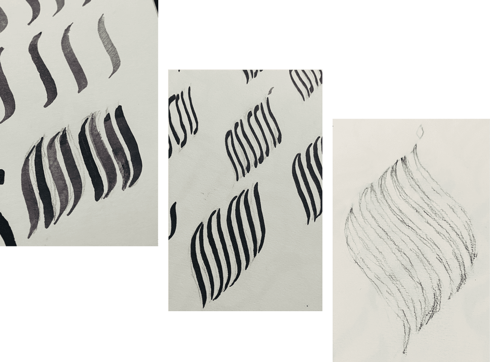
I had planned on conventional calligraphic strokes, but I eventually opted for a more refined look similar kufic block style so it remains readable in various sizes.
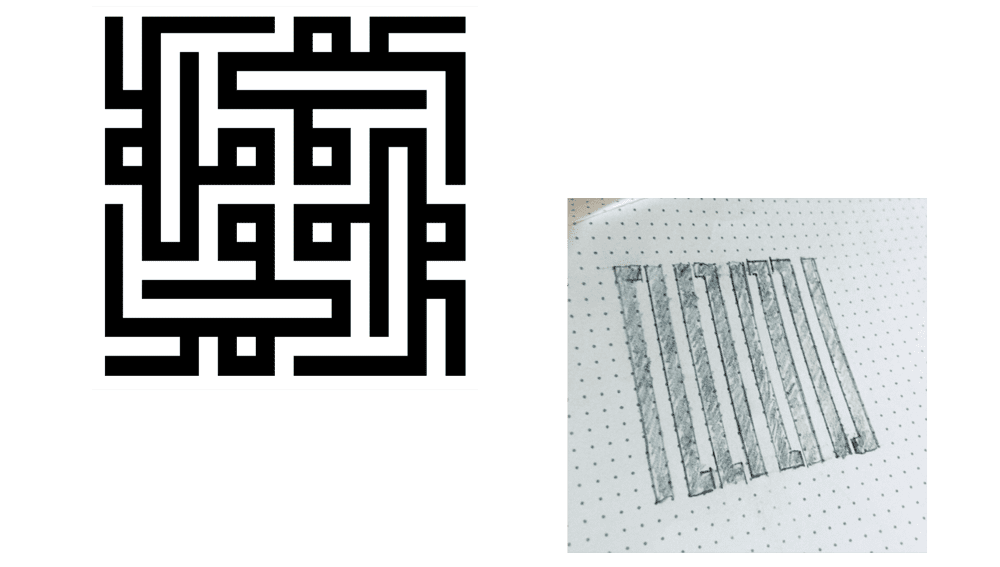
Drawing bold parallal lines seems simple but chieving visual balance can be a challenging task. I came across this great tip from Graham Smith, one of the geniuses in the industry and a huge inspiration, on how to adjust lines and negative space for better visual balance, much like IBM did.
The IBM logo is a great example of how a logo is adjusted so that it works well on both white and black backgrounds.
— Smithographic℠ (@smithographic) June 6, 2019
So the white 8-bar logo version (white on black) are slightly thinner at 10, whilst the black 8-bar logo version (black on white) are 10. pic.twitter.com/ayd7eOMnip
I followed that while creating my logo.
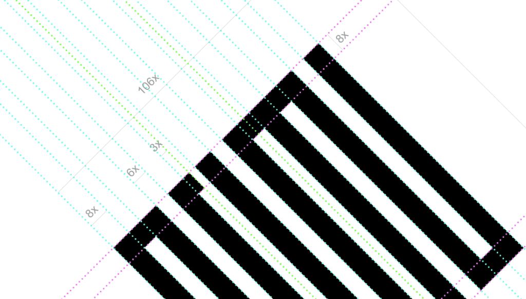
Ambigrams have always fascinated me. They can be challenging to pull off and understand without making them appear forced, but I am pleased with the outcome.
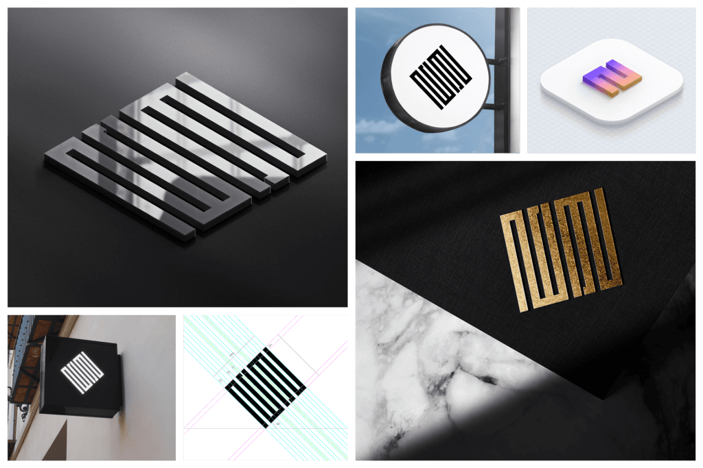
Let me know in comments what do you think about it.
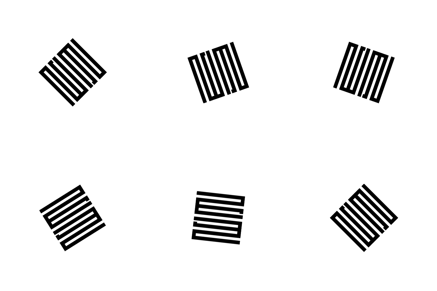
* Calligraphy example images from Wikipedia.

nomi is an experienced Product Designer from Pakistan. He creates stunning websites that are both aesthetically pleasing and highly functional. He specializes in front-end design, coding, brand identity, and packaging design. Find him on Twitter @nomiDesigns
